


mockup by freepik

original logo by Dopamine
RU: Хочу предоставить Вам свою работу с компанией Дофамин. Передо мной была поставлена задача провести ребрендинг фестиваля. Я разработала новый логотип, подобрала фирменные цвета и шрифтовые гарнитуры, создала фирменный паттерн и оформила носители фирменного стиля в виде билета, кепки и бейджиков для сотрудников и гостей фестиваля. Сверху Вы можете видеть вариант логотипа ДО.
ENG: I would like to introduce you to my work with the Dopamine company. I was tasked with rebranding the festival. I designed a new logo, selected corporate colors and typefaces, created a corporate pattern and designed corporate identity media in the form of a ticket, cap and badges for employees and guests of the festival. From above you can see a variant of the logo BEFORE.
ENG: I would like to introduce you to my work with the Dopamine company. I was tasked with rebranding the festival. I designed a new logo, selected corporate colors and typefaces, created a corporate pattern and designed corporate identity media in the form of a ticket, cap and badges for employees and guests of the festival. From above you can see a variant of the logo BEFORE.
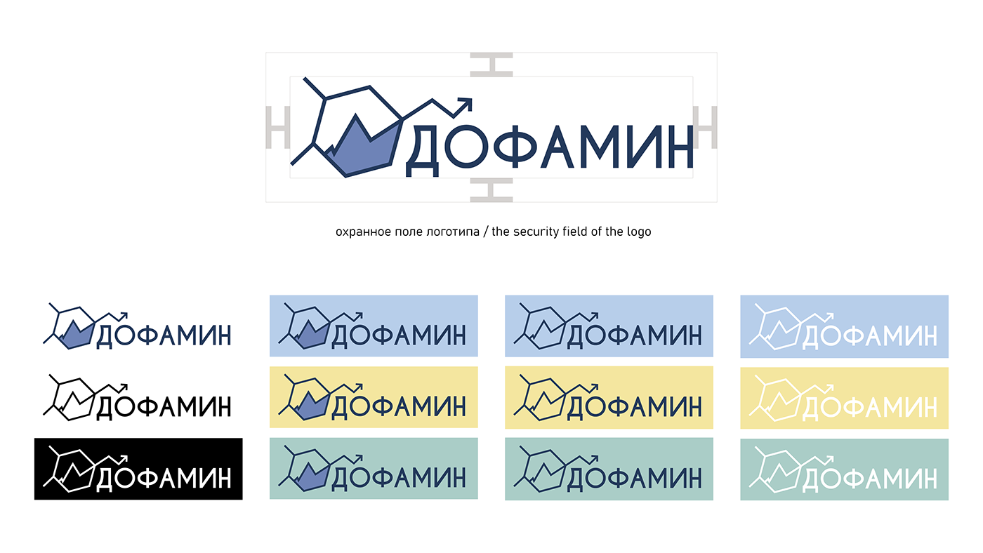
RU: При работе с логотипом было принято решение не уходить далеко от первоначальной версии. Я использовала ту же структуру дофамина, однако внутренние элементы заменила силуэтом горы, поскольку фестиваль проходит на свежем воздухе и посвящен физической культуре и бизнесу. Для связи с бизнесом я добавила стрелку, которая похожа на линию графика бизнес-плана. От градиента было решено отказаться в пользу упрощения цветовой палитры и использования логотипа на разных подложках.
EN: When working with the logo, it was decided not to go far from the original version. I used the same dopamine structure, but I replaced the internal elements with the silhouette of a mountain, since the festival takes place outdoors and is dedicated to physical culture and business. To connect with the business, I added an arrow that looks like the line of a business plan graph. It was decided to abandon the gradient in favor of simplifying the color palette and using the logo on different substrates.
EN: When working with the logo, it was decided not to go far from the original version. I used the same dopamine structure, but I replaced the internal elements with the silhouette of a mountain, since the festival takes place outdoors and is dedicated to physical culture and business. To connect with the business, I added an arrow that looks like the line of a business plan graph. It was decided to abandon the gradient in favor of simplifying the color palette and using the logo on different substrates.


RU: При создании паттерна я решила использовать модуль. Паттерн содержит в себе треугольники и шестигранники дабы соблюсти стиль логотипа.
ENG: When creating the pattern, I decided to use the module. The pattern contains triangles and hexagons in order to maintain the style of the logo.
ENG: When creating the pattern, I decided to use the module. The pattern contains triangles and hexagons in order to maintain the style of the logo.


mockup by freepik

mockup by freepik


this work is educational, none of these elements will be used commercially


